Friday, 25 October 2013

My Own Personal Music Tastes


"I like the way that other types of music can make people dance, however I've chose to represent my own interpretation of dance, this includes the types of music that I like to "dance" to. This includes various DJ's, ARTISTS and BANDS."
I think by including music tastes I like it may appeal to other audiences and the target audience of my magazine, due to the similarity in age and that the artists I have chosen are quite well known and are popular in todays modern society.


DAVID GUETTA

JAKE BUGG


AVICCI


MUMFORD AND SONS


Thursday, 24 October 2013

Preliminary Task- College Magazine.

Preparation;
When taking the photos for my college magazine I knew that they had to all have the same semantic field, which was college, by doing this the magazine would appeal to students and would make it more suited to the tasks criteria.
I chose the photos I used in my magazine because I thought they went well with the sell lines and the front cover image was suited, as it was a student. I also used images which were taken all aroun the college of various components of a students enviroment for example the common room, the cantine, other students and the equipment that they require.
I came up with the name Ed'you'cate when thinking of a title for my magazine, I think that this is a fun way of showing that it is a college magazine and its helpful to the reader.
 
What the front cover looks like;
Whats on it;
When designing the front cover I knew that the best colour to use would of been blue to tie in with the model's shirt, therefore I used two different shades of blue to help tie the whole thing together. I added various sell lines to make the front cover look more interesting and informative, for example I added in information about other students life and helpful tips such as how to deal with the stress of being a student. I also added other conventions of a front cover such as the barcode, the price, the date it was issued, and another image to just make the front cover look more appealing. I also included two straplines which I think makes the magazine look more presentable, The top strapline is a bit of a slogan as its a bit of extra information on what the magazine is about, the bottom strapline however includes more information about what is inside the magazine for example more hints and tips for a student on how they can use there student card effectively and wisely. i also added a sticker effect to claim that this magazine in particular had won 'Favourite student mag of the year' this way it is a bit of self promotion as it is making the magazine look more reliable and helpful. Finally I added the Facebook and Twitter logo and added in made up user names so the magazine would be more suited to the target audience as the user is most likely to be part of a social networking site.
 
Feedback;
My lecturer marked my work then gave me feedback on the positives and improvements, if any was needed.
In my feedback I was told that she loved the name of the magazine because it was unique, she also went on to saying that I selected an appropriate image and that it had a good eyeline view for the audience. She then went on to saying that i clearly understand the conventions of a magazine and the layout.She also said that my sell lines were appropriate to the target audience.
I then recieved feedback for areas of improvement these were that i could of used a 3rd colour to help the college magazine front cover work together more, she suggested that I could use a red, which also ties in with his shirt.
 
What the contents page looks like;
What's on it;
This contents page includes many images which are all appropriate for the target audience which was college students. It includes 9 sell lines and page numbers to help the user find where the article/activity is and on what page. The title was then added using an old school font which was then edited to have a glowing effect, this way it stands out more and ties in with the elements of green which appear in some of the photos below it. I made a small collage of images around the contents page to make it look more fun and appealing I did this by inserting different image sizes and shapes, and fitting them all together so they would create the effect that they curve around the page and frame the text which was positioned on the top left hand side, with one more prominant sell line which includes information about the college which I go to and some exciting news about new computers which would entice the audience.
 
Feedback;
The feedback I recieved was very similar to the front cover, in terms that the images were appropriate and the sell lines appealed to the target audience.
However to improve the contents page it was suggested that i need to anchor all the images to a page numebr so its more clearer to the audience where everything is and what the image is about.

IDEA CHANGE!!!!

WHY I CHOSE TO CHANGE MY IDEA;

AFTER LOOKING THROUGH DIFFERENT MAGAZINES AND MY QUANTATIVE RESEARCH I HAVE CHANGED THE GENRE OF MY MAGAZINE TO DANCE MUSIC. BY CHOOSING TO DO THIS I THINK IT WOULD BE MORE SUITED TO THE AUDIENCE I WAS GIVEN AS ITS MORE POPULAR.

THE MAGAZINE LAYOUT WILL STAY EXACTLY THE SAME AND EVERYTHING I HAVE PREVIOUSLY DESCRIBED, HOWEVER THE MODEL MAY CHANGE AND A SLIGHT CHANGE IN THE COLOUR SCHEME.I PLAN TO ADD BLUE AND PINK WITH THE BLACK AND WHITE SO THAT IS IS UNISEX BUT ALSO MORE COLOURFUL THIS WILL REPRESENT THE DANCE MUSIC GENRE WELL.


WHO IVE CHOSEN TO DESIGN MY MAGAZINE ABOUT;
In june 2013 I went to see DAVID GUETTA and RIHANNA live at the stadium. I must say this was one of the best nights I've ever had. David Guetta was an amazing experience as he mixed popular songs and got everyone dancing, the atmopshere was amazing and really played a big part in the sucess of the night. His type of music is a perfect example for what i would liek to include in my magazine as I love his songs and his collaborations with various artists.

This image was taken by me, this is where I was stood listening to David Guetta. The way David Guetta got every one dancing and involved them frequently by muting the music so the audience could sing back to him. He also interacted with with the audience by signaling hearts to the audience, blowing kisses, directing us to wave in certain directions, telling us to "PUT YOUR F*CKING HANDS UP" and to "JUMP".

Wednesday, 23 October 2013

Quantative Research.

As part of my research I was asked to create a questionnaire, I created 13 copies of this questionnaire which had 10 questions. I then handed this out to family and friends and asked them to fill it out, by doing this I could receive feedback and an opinion from people with different tastes and music likings to me.

Q1.WHAT COLOUR SCHEME WOULD YOU PREFER TO BE ON A FRONT COVER OF A MAGAZINE?


The results were expected as I knew that "VIBRANT COLOURS" would be the popular option, however one person picked "BLACK AND WHITE", and no one picked "NEUTRAL COLOURS" which I was worried about as I didn't want to use vibrant colours and I would like to have the BLACK, WHITE and RED colour scheme in my magazine.


Q2. WOULD YOU BE ATTRACTED TO A LARGE  FONTED OR A SMALL FONTED MAGAZINE MAST HEAD?

It was very obvious that everyone would pick "LARGE FONT", I think this is because that everyone these days is used to seeing large fonts on magazines in shops, however I agree with this decision to make the mast head very large and outstanding. By my research confirming this decision I feel confident that people will like the MAST HEADS'S appearance on my magazine.

Q3. WHAT IMAGE WOULD YOU PREFER TO BE ON THE FRONT COVER OF A MAGAZINE?

There was a range of different images listed on this question, mainly because the question was a open question, therefore the people could answer anything they wanted, some of the answers included;

  • RELEVANCE TO MAGAZINE CATEGORY
  • CELEBRITIES
  • MENS BODIES
  • COLOURFUL IMAGES
  • FOOD
  • CLOTHES
  • MODELS
  • MUSIC BANDS
After receiving these answers I knew that choosing to represent a celebrities using a model would be a good idea as this is what people would prefer to see on a magazine.

Q4. WHAT IS THE AVERAGE PRICE OF A MAGAZINE YOU WOULD NORMALLY BUY?


Expectedly no one would pay below £1.00, this isn't really surprising as there isn't many magazines which are below this price margin. The majority of people said that they pay between £1.00-£3.00 which is the average price of a magazine these days, however a small amount chose the £3.00+. Based on this is would aim to price my magazine around £1.50-£2.50.


Q5. HOW OFTEN DO YOU BUY A MAGAZINE?


When people answered this question it was evident that the majority of them bought their magazines monthly, however this outcome is like this because many of the magazines that were bought only came out each month, therefore this leaves the buyers only buying them once a monthly. Furthermore weekly wasn't that common and fortnightly was n the middle, having taken this into account i have decided to make my magazines a magazine which is available monthly to the audience/buyers.

Q6. WHAT MUSIC DO YOU LISTEN TO MOST OFTEN?

For the question I received a huge variety of answers, as my audience varied from different friends groups who have different music/lifestyle tastes therefore this was expected. When reviewing the research there was only a couple of answers which were the same therefore I had 9 different answers these included;

  • Rock
  • Pop
  • Chart
  • Punk
  • Hardcore Metal
  • House
  • R&B
  • Dance
  • Retro
The most popular answer was pop and dance music therefore I took this into consideration and this swayed my decision to choose this type of music instead of the original idea i had of writing about the rock band BON JOVI. I have now decided to base my magazine on my own twist on dance music.

Q7. WHAT TYPE OF MUSIC WOULD YOU MOST LIKE TO READ ABOUT?
 
When reciving answers for this i expected to revieve a huge variety as people ahve many different tastes, hwoever there was only 5 options to chose fromas i though this restricted the asnwers and would help me more. As expected many people enjoy reading about POP music the most as this is the mort popular type of music about these days due to the various chart shows and radio channels. after reading this i thought that DANCE music should of been a option therefore I would of got an idea of what the audience would of gone for, however this was before I finally made my mind up about my magazine and its contents, this will help me alot as i know that the genre i have chosen is very similar to the most popular option, therefore i will continue to design my magazine around that genre.


Friday, 18 October 2013

Institutional Research.


I was asked to look for information about different institutions as part of my magazine design research, I was given a list and I had to find out about the different institutions and what type of publications they produced. We had to do this to find out which type of institution we think will want to produce my magazine and advertise it to the public. This is what I came up with;


EMAP;


"Our purpose is to connect professional communities and inspire them to know, to grow, progress and win.  Brands such as HSJ and Retail Week create deep relationships and unparalleled reach, to increase value for our customers. We deliver this through senior networking events; industry leading awards; online data products; social media communities; headline conferences and, of course, critical insight, news and analysis. We hear the market agenda, and create innovative solutions and better ways for our advertisers and sponsors to connect with their audience. We provide highly valued subscription services and are rewarded by a following." 


EMAP publish and advertise certain brands, these brands were then section into groups such as;
  • Retail
  • Middle East & North Africa
  • Health
  • Goverment
  • Environment
  • Construction & Engineering
  • Architecture 
EMAP also publish up to 20 magazines which are presented in their current portfolio, these magazines include;
  • Architects Journal
  • Architectural Review
  • Broadcast
  • Construction News
  • Drapers
  • Health Service Journal
  • Local Government Chronicle
  • Materials Recycling Week
  • Nursing Times
  • Retail Week
  • Recycling & Waster Management
  • Screen International

However they produced magazines which are no longer in their portfolio such as PC Leisure, The One and The Face.


CONDÉ NAST;

"Condé Nast is a division of Advance Publications, It is a magazine publisher. In the U.S. It produces 18 consumer magazines.Condé Nast is largely considered to be the originator of the “lifestyle magazines” a type of magazines focused on a particular class or interest instead of targeting the largest possible readership. Its magazines focus on a wide range of subjects, including travel, food, home, culture, and other interests, with fashion the larger portion of the company's focus. More recently, Condé Nast has expanded its offerings to include marketing services and consumer-focused products such as apps and licensed merchandise."

Condé Nast produce numerous magazines these include;

Fashion and lifestyle

  • Vogue
  • W
  • Glamour
  • Allure
  • Self
  • Teen Vogue
  • GQ
  • Details
  • Lucky
  • Style.com/Print
Food
  • Bon Appétit
  • Epicurious
  • Gourmet Live

There is also many more, they are sorted into groups such as Travel, Gold, Culture, Golf, Bridal etc.


NAT MAGS;

"Nat Mags (short for National Magazine Company) was a British magazine publisher based in London. It was established in 1910 by William Randolph Hearst and was a wholly owned subsidiary of the Hearst Corporation." 

"Nat Mags expanded into digital media"

"Nat Mags soon launched its digital arm Hearst Digital to act as an umbrella for Handbag and its other web acquisition, Net Doctor.

Nat Mags merged with Hachette Filipacchi Médias UK in 2011 to form Hearst Magazines UK."

Nat Mags produced many magazines such as;

  • Best
  • Coast
  • Company
  • Cosmopolitan
  • Cosmopolitan Bride
  • Country Living
  • Esquire
  • Good Housekeeping
  • Harper's Bazaar
  • House Beautiful
  • Men’s Health (UK only)
  • Prima
  • Prima Baby
  • Real People
  • Reveal
  • Runner's World (UK only)
  • She
  • You & Your Wedding
  • Zest magazine


IPC MEDIA;

"IPC Media Ltd (formerly International Publishing Corporation), a wholly owned subsidiary of Time Inc., is a consumer magazine and digital publisher in the United Kingdom, with a large portfolio selling over 350 million copies each year."

"PC then set up a management development department in 1965, to rationalise its holdings, so that its various subsidiaries would no longer be in competition with each other for the same markets"

'In April 2012 IPC Media scooped an award for Best Production Team of the Year at the Professional Publishers Association Production and Environment Awards 2012."

IPC have many magazines as companies with their name within the making of these publications, these publications include;


If you didn't notice, then I'll point out now that NME was part of the list. This is a well known music magazine, this is why its important that I take this institution into consideration, as NME is very well known and is very successful.


FUTURE PUBLISHING;

"Future plc is a media company; in 2006, it was the sixth-largest in the United Kingdom. It publishes more than 150 magazines in fields such as video games, technology, automotive, cycling, films and photography. Future is the official magazine company of all three major games console manufacturers. It is a constituent of the FTSE Fledgling Index. The company also owns the US company, Future US."
"In January 2012, Future sold its U.S. music-media brands, including Guitar World and Revolver magazines to New Bay Media LLC for $3 million. In April 2013, it completed the sale of major components of its U.K. media-music brands for ₤10.2 million to Team Rock Ltd. "

MUSIC;
Magazines:

  • Guitarist
  • Guitar Techniques
  • Total Guitar
  • Rhythm
  • Future Music
  • Computer Music
FILM;
Magazines:
  • Total Film
  • SFX
  • SFX Presents
  • Comic Heroes
COMPUTING;
Magazines/Digital Editions:
  • Mac|Life
  • MacFormat
  • Maximum PC
  • PC Format
  • Windows 7: Help & Advice
  • Windows 8: The Official Magazine
  • Linux Format


BAUER MEDIA:

"Bauer brands include women's weekly and TV listings magazines; namely Bella, Take a Break, that's life! TVChoice and Total TVGuide as well as a number of puzzle magazines"

"Bauer Media Group is a multinational media company headquartered in HamburgGermany which operates in 16 countries worldwide. Since the company was founded in 1875, it has been privately owned and under management by the Bauer family. It was formerly called Heinrich Bauer Verlag KG, abbreviated to HBV and usually shortened to H. Bauer."


Kerrang!

"Kerrang! is a brand that specialises in Rock Music. It originally began as a magazine and in 2004 Kerrang Radio was launched. A Kerrang tv channel also exists and as of 2005, all of its programme content is music videos, the majority of which is open scheduled, for text requests from their playlist." 

KERRANG is also a music magazine that I have used in a lot of my research, I have also used it in annotations and deconstructions. I used it in my mood board, as I commented on the texture of the mast head.


Q MAGAZINE

"Q started out as a music magazine published monthly in the United Kingdom. Founders Mark Ellen and David Hepworth felt the music press of the time ignored a generation of older music buyers who were buying CDs — then still a new technology — from artists such as Paul Simon, Level 42, and Dire Straits. Modeled after Rolling Stones."

Q magazine was also used a lot in my research as I like the genre of music it withholds but also because I like the layout and way the magazines draws audiences to buy it. I think that Q does this by its well known logo and its front cover images and head lines.


After looking through and researching about each institution I feel like BAUER publishing will be very much more suited to the type of magazine I'm designing. I think that BAUER will be interested in the genre of music I am writing about and making a magazine from, because the music is a very similar genre to Q and KERRANG magazines.
I think my choosing a similar institution to a magazine which is similar to mine would be ok based on the content difference, however it may also be a let down as there will be competition, furthermore I think by choosing these companies to represent my magazine it wouldn't effect the popularity of mine or any other magazines as they are different.

Monday, 14 October 2013

Flat Plans For My Magazine.

When coming up with a design for my magazine I decided to look through other magazines and choose what kind of layout,colours, pictures and text I want to use on y final magazine. However many magazines were very colourful and bold and a bit to over crowded, this isn't what I wanted for my magazine so I decided that I was going to come up with a plan that was simple but effective, this is what I came up with.

FRONT PAGE;

COLOUR USAGE: On the front page of my magazine I wanted there to be a selection of colours which I feel work together and will suite the type of music and the genre of my magazine. However after receiving my survey results it was very evident that people wanted to see "vibrant colours", which really supplied me with a problem as I wasn't too keen on this idea. Although I love the idea of having a vibrant looking magazine I feel like this is very stereotypical of magazines about these days, based on my research I have decided on using a selection of 4 colours which I love working with, and I think will help me present a well put together magazine and will work well together, these colours are black, white, grey and red.

IMAGE USAGE: When choosing an image for the front of the magazine I think that this has to be a very well thought out process as this is what will be drawing the audience towards this magazine, apposed to all the other music magazines out there. After taking this into careful consideration i think a black and white image will work extremely well with my theme colours but will also had sophistication to the magazine. Preferably I would love to have an image of the chosen group/singer represented by a model on the front of the magazine with a plain background, also I would love the shot to be at a distant where the pictures only show the model from the waist up. Furthermore I would also like the picture to face towards the audience, and I would like it to be the main focus as I would like it to overlap the strap line or head mast and i would like the sub heads to be positioned around the images to exaggerate it even more.

TEXT USAGE: I would very much like to design a logo for the magazine so that the name didn't have to be on every page, but it could be represented using a small, however I would also like to use a informal sense of language in the text to make the magazine more approachable. I would like the text to be mostly positioned on the left hand side of the page. I don't want to much text on the page as I want the main focus to be the image.

LAYOUT & FONT: I would like to use a modern font which really goes with the magazine, which is why I would like to experiment with many other fonts before making my mind up however I have my favourite fonts for example "TREBUCHET" , "FRANCIS SANS" and "BERNARD MT CONDENSED". I would like to have the setting of the writing straight and not angles and layered so its not to box like.


CONTENTS PAGE;

COLOUR USAGE: Similar to the front cover I want the colour scheme to carry on through my magazine. Furthermore the colours ill be the same on this page. I plan on using the colours effectively so that they look well put together and not too boring. I will use the colours very carefully when I place the page numbers on top of the images so that they stand out well and don't blend in with the images, by doing this they will hopefully contrast so the audience can see them. The text will also contrast to distinguish the difference between the sub heads and the description.

IMAGE USAGE: The images on the page will be paired with a sub head and description. By doing this I feel that by ding this the audience will get a better understanding of the stories and a visual preview of each topic available inside my magazine. I would like a variety of different images on the page also, I think this will be more appropriate considering this is what I like in a magazine and I want this magazine to be a representation of me.

TEXT USAGE: The text usage on this page I want to be limited as I feel that I would be more interested in the images and I don't want to read too much when the full story is further on in the magazine. Furthermore I think That by placing a small description underneath each topic will inform the reader but hopefully will leave them wanting more. I would like the writing to be in a larger style font, which is unpopular in other magazines, but I don't want it to be too over powering as I find too much text on a page unattractive.

LAYOUT & FONT: I want the layout to be very precise and not messy at all, I think that this will have a good effect on the audience as it will be well presented and easy to find what they are looking for as each section will have its own place. However I think that by  having a number of images they will be the main focus and i want them all to be positioned together and all to the right side, however I want all the writing to be on the left side and some under the images, this will be where the plus section will be hopefully. The font used will be a typical font as I don't want a fancy style text on the page because I want the magazine to be very smart and good to look at, by choosing the decision not to use a fancy style font I think will prevent the audience having to try hard to read it, therefore I have made it easier for the reader.

DOUBLE PAGE SPREAD;

OVER VIEW OF WHATS GOING TO BE ON THIS PAGE: On this page I plan to design and interview with someone, therefore the topic is an interview, this is why there is various captions and text dotted around, the captions are the questions and the text is the celebrities answer, obviously this interview is made up, I DID NOT INTERVIEW THE CELEBRITY.

COLOUR USAGE: On this double page spread I want there to be very little colour used, this is why I have chosen a very simple colour scheme which is going to be consistently used throughout my magazine. The colours I plan on using will be distributed around the page. I plan on using the red for the question and page number and possible other small parts on the magazine, the background will either be white or grey with the text been black. however this may change depending on the image used.

IMAGE USAGE: I only plan on using one image on this page, this is because I don't want it to be too over crowded. I want the image to be black and white, I also what the person to be a female, she will be hopefully wearing heavy makeup and I want it to be full body shot from a long distant, I want her to be facing away from the camera and posing, this is what I imagine the image to look like.

TEXT USAGE: The text on this page will be written in an interview style, I want the audience to feel like they are in the room and listening to the interview, I plan on describing whats happening. As I'm a English student I will use some techniques to draw in the reader. the font wont be too big as I don't want the writing to look unprofessional. 

LAYOUT & FONT: The layout yet again will be very well presented, over lapping will occur as I like the effect it has. I think the layout i have created will look effective once the text and image will be placed properly. I think this is a typical set out double page spread and is common among other magazines. the font will be a professional looking font, however this may differentiate between the captions headline and the text.

Thursday, 3 October 2013

Contents Page Deconstructions

This contents page is filled with loads of words and information about bands and what is included in this issue of NME. The NME logo/name is also added onto the top of the page with the head mast ‘THIS WEEK’ in a very large bold font, this way the reader knows that this is the contents page. The date is also added underneath with a black stripe with a white font. As well at the black stripe the sub heads have a black background with a large white font explaining the topics available in the particular section. To the right of some of the topic there is a arrow with ‘ON THE COVER’ wrote on, this then lets the read confirm the page numbers with the stories on the front cover, this would be useful if the reader was really interested in the stories and wanted to read more. At the bottom of the contents list there is a ‘PLUS’ section, which is presented, in a smaller font, which could suggest is less significant than the more informative stories located above. At the very bottom of the right side there is a red box with ‘THE UK’S NO.1 GIG GUIDE’ this could make is superior because it has its own box and own area, this could be because it is more significant to the magazine and what it includes inside it. Right in the middle of the contents page there is a small story which is accompanied by a large image, the sell line is quite controversial as people might not like the advertisement of getting “HIGH” however the story seems to be about a local pub which could add a bit of real life into this magazine filled with celebrity singers/band. On the bottom of the page there is a advertisement for subscription to the magazine, also with a offer explaining there is 33% off, this is presented in a vibrant color which contrasted with the back banner. This also provides contact details to the magazine. On the left side of the page there is a ‘BAND INDEX’ which provides extra information for fans of the bands but also adds a unique edge to the magazine as I haven’t saw this is any other magazines. The color theme on this contents page is the typical NME colors; black, white and red, these are distributed well over the page and don’t make it look too colorful and over the top.


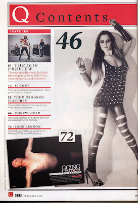
This Q contents page is very minimal in terms of not holding to much information however there is a small use of large images, including the picture, which over laps the head mast banner and covers up more than half the contents page. The head mast has a red background that contrasts with the color of the writing located in front of the red banner; the 'Q' logo however is located on the top left corner before the title of the page. The logo is represented in the way it is on every magazine of theirs, a bold, upper case letter Q in the color of white, by doing this it is stereotypical of Q magazine. The 'contest' however is presented in a small very toned down font, in the color black, however this doesn't contrast with the red background to much as it is a dark color and the shade of red used is very dark, this could be a thing that I think Q magazine would benefit from altering. This contents page isn't informative at all, considering only 7 stories are mentioned in some way on the contents page it doesn't reveal too much about the actual contents of the magazine, this could mean that the magazine hasn't really got a lot within the magazine of they could of just wanted to keep the contents page very simple looking and not over crowded. The choice of images used on this front cover represent both genders as a gorgeous female model, a male and a band are shown on the contents page. By placing the female model largest on the page and giving it the most space suggest that Q wants this image to be the main focus on this page, they achieved this by overlapping the image onto the Q contents banner, this gives this image a superior status compared to the other stories on this page. The actual list of the contents is located on the left side of the page and actually only includes 5 stories and a small description underneath the sub head. The sub heads are in a bolder font than the description this help distinguish between the description and title, however they are also distinguished by using a line to separate the two pieces of text. By choosing a red line to do this it not only shows the difference but it also help bring out the red in the banner as well as the separation lines. Furthermore the subheads used are celebrity names therefore not much description is needed as long as the fans and audience know that the stories are obviously going to be about them celebrities, this also could attract other audiences as the celebrities on this contents page are singers but the styles of music really contrast. The page numbers on the contents page are varied in sizes for example on the smaller less obvious stories the remain the same size as the text but on the images, for example the main image, the page number is presented in an extremely large font. This stand out a lot therefore the reader doesn't face any confusion when trying to find the right page. The themes colors used on this page are black, grey, white and red, these colors really tie together as they don't clash but they work together really well, with only having on bright colors which can be smarty used to help make certain areas of the page stand out a whole lot more than other parts.


This MOJO contents page is a very simplistic looking contents page, and it isn’t represented as one either, I think this is because there isn't a "contents" label on the page which may cause confusion to some of the audience, However the pages title is just simply the company name, "MOJO". this isn’t placed within a banner or neither does it have any type of separation lines, the background behind the title is the same as the rest of the page, this however has a great effect due to the layering of the title and its position of being brought to the front. Underneath the title there is a small section separated from the rest of the page, this is separated using two long white lines which cage around the writing within. The writing inside the lines is the date and issue number of the magazine. I suspect that this information will have also been present on the front cover which means it has been repeated on the following page. The issue number and date however was separated using an image which over laps the lines. This image of Florence is a very independent feeling image as it shows off Florence’s curves and her figure by the position she is standing in. Florence’s head over laps the banner, and in turns separated these two pieces of information. The image is a photo of Florence, she is faces towards the left and has her head/chine slightly risen, by doing this is accentuates he body. By positioning her like this and placing the photo where it is, this makes Florence look like she is looking towards the date, by doing this the reader may be drawn to look at the date more than what they would have, if it was a different image. The writing on this page is placed to fit into the shape of Florence’s body; therefore it’s a quirky way of representing the writing to fit in around Florence. The sub head on this page is the "FEATURES" section which contains more sub heads and a slight description along with the page number. The word "FEATURES" is presented in a red, upper case, bold font, this is also the case with the page number, by doing this is stands out from the rest of the text but also makes the writing superior to the other pieces of text on the page. Each sub head is wrote in a higher case, bold white font, this again makes it stand out more from the other pieces of writing, for example it stands out more than the description of the stories on that page. Underneath the stories there is a red separation line which holds the cover story within it, by doing this is it given its own section; it is also confirmed to be the cover story. this piece of text is then followed by another line which separates all the stories from the tag line which goes with the images, by placing this at the bottom this is typically one of the last things the audience should read, so it is then paired with the first thing the reader would most likely look at, the image. the colours used on this contents page are very simple and are very popular within magazines, by pairing the black, white, grey and red its makes the red stand out the most because the red is the only vibrant colour used on this page. The use of red really ties in well with Florence’s hair colour and makes it all look well presented.

By looking at other magazine contents pages it has helped me by inspiring me and giving me ideas for my own magazine contents page. I will apply the elements of these magazine to mine in small bits as I don't want to copy however I want certain elements to be included but with my own spin on things.